3dexperience SolidWorks Share and Markup
Introduction to Effective Data Representation with Metrics Readers
Metrics Reader is a cutting-edge application for public cloud dashboards that provides a range of essential features. With Metrics Reader, you can effortlessly generate charts based on your imported datasets, enabling you to gain valuable insights and analyse the data effectively. Additionally, this powerful tool allows you to compare multiple charts, empowering you to make informed decisions based on comprehensive visualizations.
Metrics Reader is compatible with 3DDrive, Social Analytics, and Potion for enhanced functionality.
When incorporating a Metrics Reader widget into your dashboard, it is essential to customize it with your specific data set to showcase a chart.
You can modify the settings of any Metrics Reader widget that you have personalized.
By importing your own data (.CSV or .XLS), you can analyse trends and uncover valuable insights through customizable charts and graphs.
The Task Shows:
- Select data type.
- Import data.
- Select Range.
- Customize.
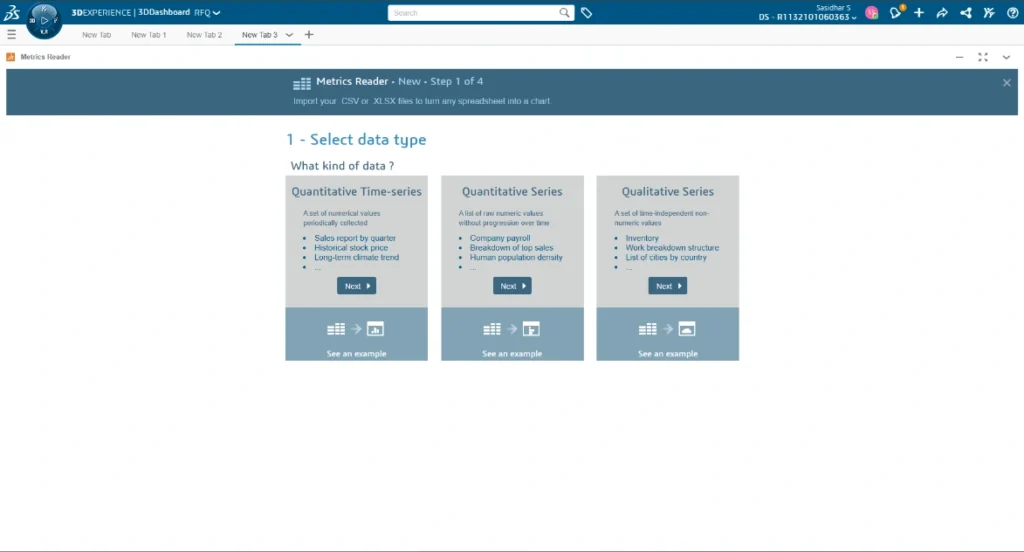
1. Select Data Type:
- Quantitative Time-series
- Quantitative Series
- Qualitative Series
Quantitative Time-Series:
Bring in a collection of numeric data gathered at consistent time intervals. We will closely examine the Quantitative time series.
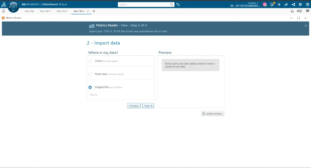
2. Import Data:
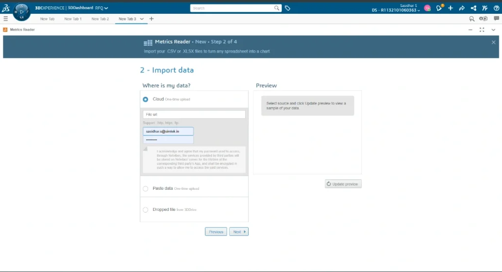
There are three options for importing the data.
Cloud (One time upload):
This is a one-time upload process where you will need to enter your Login ID and Password in the File URL field.
Select the Cloud option and enter the URL of a file saved on the cloud. If access is limited, please provide your login information.
Note: Your 3DEXPERIENCE Platform requires Internet access if the URL you provided directs to an online resource.

Paste Data:
Select the “Paste data” option and then paste the data that you have copied from your clipboard.
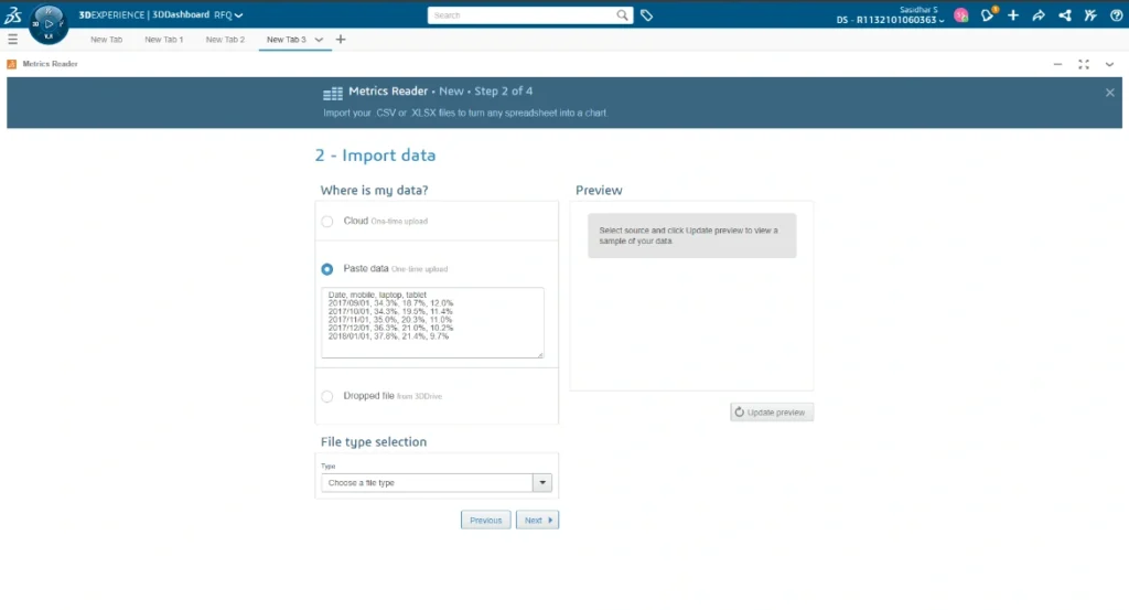
Dropped file:
Choose the dropped file and effortlessly transfer a file from your 3DDrive (3DDrive is the storage application located on the 3DEXPERIENCE Platform. To draw a parallel, it functions similarly to Dropbox, Google Drive, and OneDrive. Interestingly, these three programs can also be seamlessly integrated into 3DEXPERIENCE).
In addition, there is an advantage to editing the dropped file from 3DDrive, as it will automatically update the Charts.
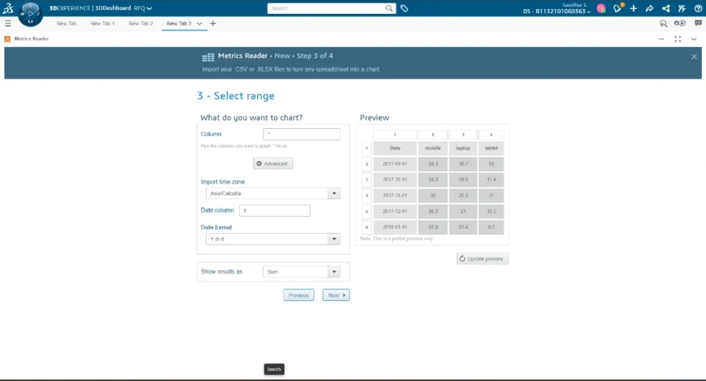
3. Select Range
You have the option to choose a column and import the time zone, indicating the date column and the desired date format. Additionally, you can display the results as Sum, Average, Maximum, or Minimum.
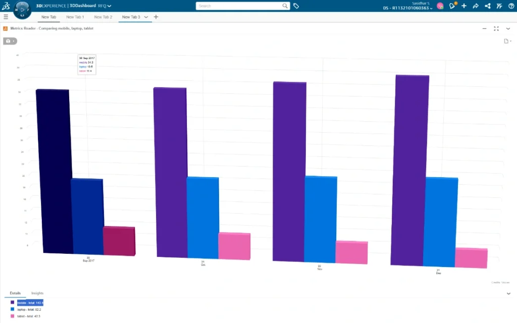
4. Customize
Within the design tab, you can modify the sequence of your products using Forecast, Smooth curve, Linear regression, total, and time zone. Additionally, you can define the name and Source URL in the Credits tab before choosing the Chart type displayed in the image.
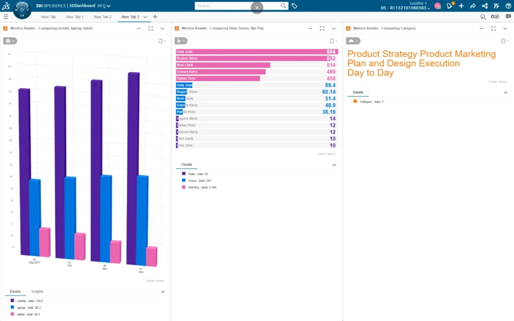
The personalized dashboard is utilized by millions daily to effectively monitor, customize, and share various aspects of their digital lives. Depending on your company’s needs, you can choose from a variety of chart types and configure multiple metric readers on the desired tab within the dashboard. This ensures that all the essential data of your company is conveniently accessible on a single page.
Essentially, this tool can assist you in replacing the outdated process of manually analysing Excel files, which often results in errors and is quite time-consuming. Moreover, it can be conveniently accessed from any location, at any time, and on any device – all you have to do is log in to the platform to access it.